Whether you have a blog or an e-commerce site, you need to create a homepage that will grab your visitors’ attention and keep it. That’s because people who visit your website will take one look at your homepage and know in seconds whether they want to stay on your website or click away. With a great website builder, you can tweak tons of templates until you get a homepage that sends visitors flocking to your website. And the best part is, website builders are ridiculously easy to use!
Table of Contents
What makes a good homepage design?
Here are the features of a great homepage:
- Introduces your website. Your homepage is a peek into your website. It answers questions like, “What is this website for?”, “Who is this website for?” and “Why is this website different from others?”
- Speaks the language of your target audience. A website that’s trying to attract golf-playing retirees will look a lot different from one that’s trying to attract fashion-forward high schoolers. You can’t design a homepage that appeals to absolutely everyone. So, instead, design a homepage that speaks directly to your target audience.
- Includes Calls To Action (CTA). Your homepage is unlike any other page on your website, because the goal of your homepage isn’t to get visitors to spend tons of time on it. It’s to funnel your visitors to other pages on your site. To do that, you have to tell your visitors what steps they should take once they land on your homepage. Great examples are things like “Learn More”, “Buy Now” and “Free Trial”.
- Dynamic. The best homepage designs are constantly changing to reflect current events, holidays, and visitors’ needs.
Now that you know what makes for an effective homepage design, take a look at our six sample website designs to see how they attract visitors and get them to stick around.
1. Embrace the season
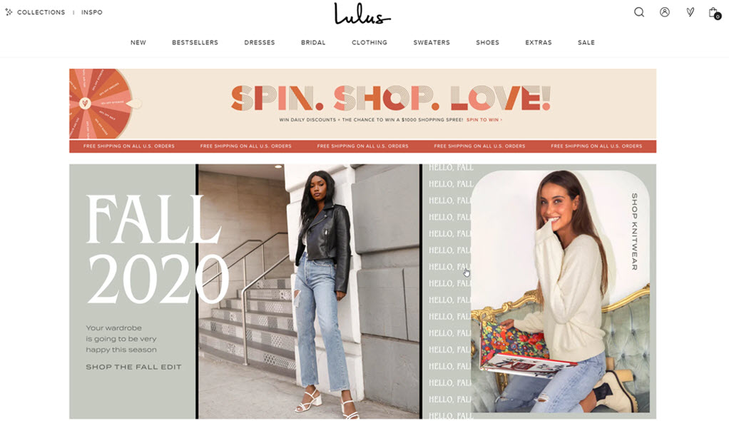
Why this works:
- This copy speaks the language of the target audience. The website doesn’t say “It’s Autumn” or “Greetings. We notice the leaves are changing”. The cheerful “Hello, Fall” is fun and youthful, just like this website’s target audience.
- The CTA (“Shop the season”) on this sample website is written in a contrasting color, and the image is composed in a way that draws the eye to it.
- The menu bar uses specific search terms that are easy to navigate, like “dresses”, “bestsellers” and “bridal”.
2. Less is more
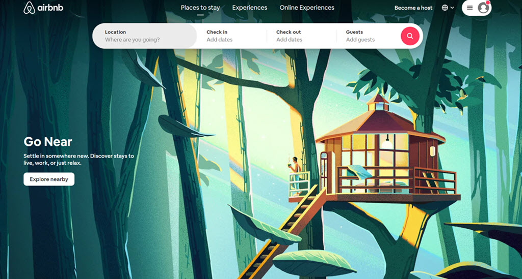
Why this works:
- Most people who visit the Airbnb website are looking for accommodation in a certain place at a certain time. That’s why Airbnb’s homepage includes the destination and date form, so visitors don’t have to look around too much to find what they’re looking for. If most people who visit your website are looking for one thing, find a way to include it on your homepage.
- The copy is simple and specific. “Location”, “Check in”, and “Add guests” are all simple pieces of copy that are unlikely to confuse visitors. If your website appeals to a wide audience, keep your copy crisp and clean. Don’t get so trendy that you alienate some of your visitors.
3. Toot your own horn!
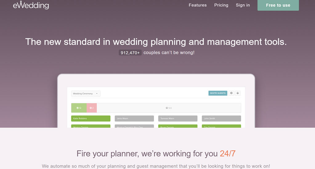
Why this works:
- A counter shows how many people use (and trust) the website. Social proof is a great way to instil buyer confidence in your product, especially among new visitors. If you have a large client base, show it off on your homepage!
- The “free to use” and “24/7” are great selling points, so they’re in a contrasting color from the rest of the homepage. If there’s something special about your service, make sure you display it on your homepage in a font and color that your visitors will see.
4. Tell your visitors why they need you
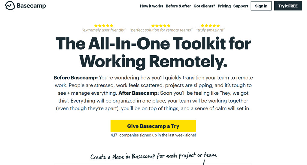
Why this works:
- This homepage goes above and beyond to demonstrate value to visitors. It shows visitors how stressful their lives look now, vs how effortless they’ll look after using Basecamp. People who visit your website want to know how they’ll benefit from it, so tell them on your homepage.
- The website also explains, in massive lettering, what the service being advertised on the website is. (“The all-in-one toolkit for working remotely.”)If your domain name isn’t self-explanatory, find a way to tell your visitors exactly what you’re offering on your website. You can do this using copy, like Basecamp, or you can use images instead.
- This homepage is also chock-full of social proof. A banner explains exactly how popular Basecamp is (“The premier project management tool worldwide”), and there’s copy with quotes from satisfied clients who say things like, “Truly amazing!”
5. Build prestige
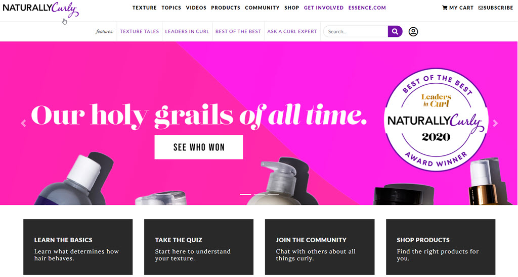
Why this works:
- On this homepage, NaturallyCurly establishes itself as the authority on all things related to curly hair. The website even has an annual award, which it gives to products that have been outstanding for curly hair. Handing out awards adds an air of prestige, exclusivity and expertise.
The copy speaks the language of the website’s target audience. “Holy grail”, often shortened to “HG”, is a term in the curly hair community that refers to a must-have product. Using the language of your visitors is a great way to connect with them.
6. Show off your bestselling products
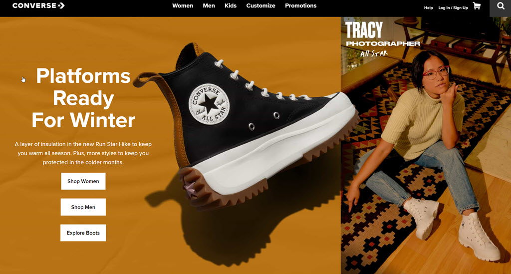
Why this works:
- If you have a product that’s been selling really well, adding it to your homepage is a great way to show it off to new visitors. That way, even if they never go past your homepage, they’ve seen your flagship product.
The Takeaway
Your homepage design will determine whether or not visitors ever get past your homepage. Follow this guide to create a homepage that makes visitors curious about the rest of your website.
Tweaking your homepage takes a bit of brainpower, but luckily, creating your website won’t. With our easy-to-use website builder, you can choose from hundreds of templates to create a website that you and your visitors are sure to love!


